Pareto Analyse - ABC-Analyse
Application - Use - Example - Tools - Templates
The Italian economist Vilfredo Pareto, 1848-1923, found out, that with 20% of the time exposure 80% of the results were reached. Also many software phenomena follow a 80/20-Pareto distribution:
| 20 percent of the ... | 80 percent of the ... | |
|---|---|---|
| Modules | Consume Contribute Consume |
Resources Errors Execution time |
| Errors | Consume | Repair costs |
| Enhancements | Consume | Adaptive maintenance costs |
| Tools | Experience | Tool usage |
Application
Pareto analysis is used for identifying the one or two situation categories in which most of the problems occur.
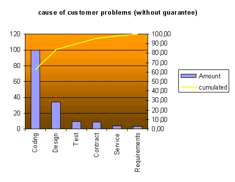
A chart (Pareto diagram) represents visually the distibution of studied occurrences, whereby the most frequent occurrence is represented on the left-hand side. The other occurrences will be represented in descendeing order to the right.
Use
- Define the categories to be studied (5 to 10 categories).
- Sort the data (new and representative) into categories.
- Arrange the categories in a descending order by data.
- Make a bar graph, highest category left.
- Check the diagram for Pareto pattern.
- If the highest categotries are responsible for the most of the effects:
then: Use the Pareto diagram as a guide for taking measures or for further analysis.
else: The choice of categories should be verified.
Example
Cause for customer problems, categorized by process steps.

Tools
MS EXCEL
StarCalc
Templates
MS EXCEL- activate the macros

